

Our menu design selected among The Best Menu Print Designs by DesignRush
The word Tuan which means “round” in Chinese has a very significant meaning in Chinese culture. It symbolizes union and gatherings together.
TuanTuan is a Chinese Brasserie restaurant with French interiors. Their cuisine took inspiration from asian food influences that originated in HongKong, China and Canada.
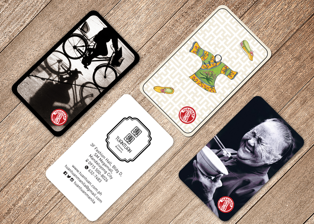
Our design team designed the Brand Logo and Visual Brand Identity with collaterals to enhance brand experience such as takeout packaging, placemat, menu and business cards.
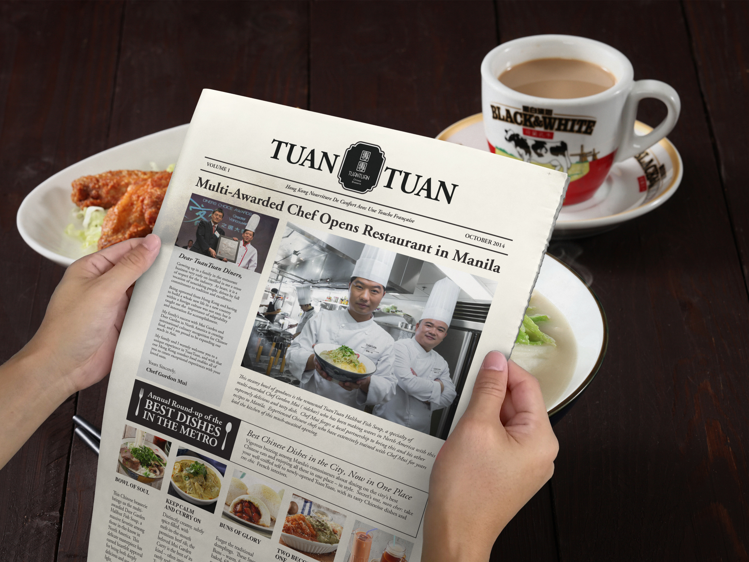
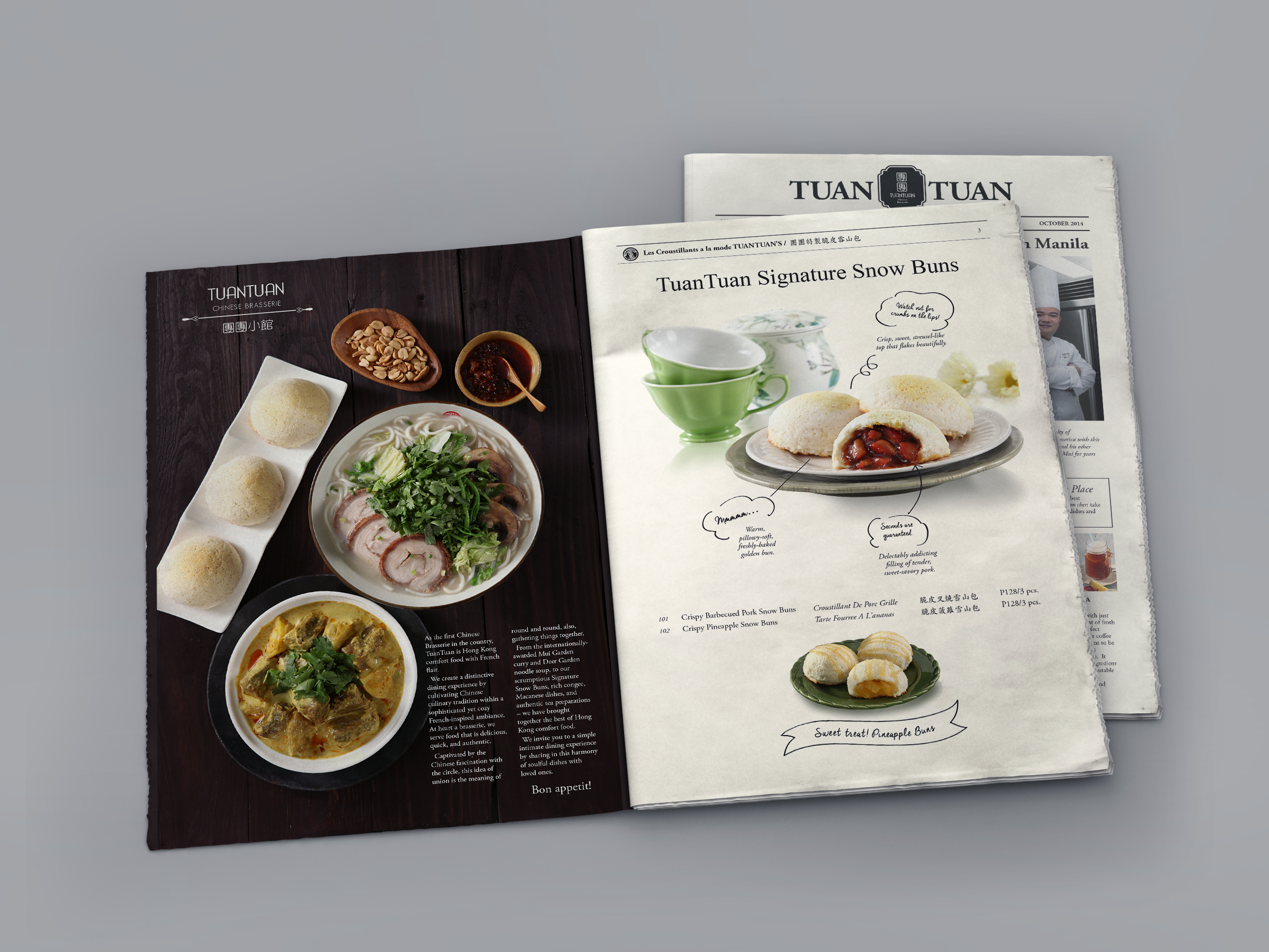
The menu design format gives some form of nostalgic customer experience — reminding clients of the days when we actually sat in the comfort of our homes reading newspapers.
Tuantuan’s Menu Design is selected among The Best Menu Print Designs by DesignRush